Upon visiting a well-designed site, I leave feeling satisfied. I've accomplished my task, and if the site is designed correctly, I've done it in the least amount of time necessary. A burden has been lifted from my shoulders, all thanks to this inanimate, end-all, be-all called the Internet. But why?
I've decided to explore studies about web design and see why certain things work and why others don't. The studies I've found examine how users think, what they want and what works. I truly believe that with any aspect of design, if you can view it as how well it would serve the end-user, you will get good results in your final product.
First, I'd like to explore how the text is laid out.
It should be displayed like the image below, according to a study called Eyetrack III, a study that explores what websites look like through reader's eyes.
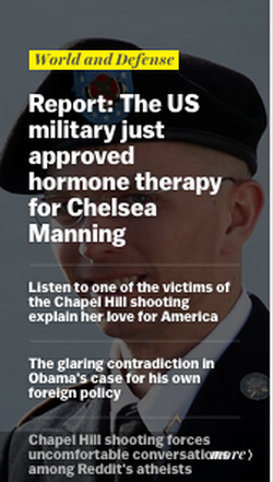
This image is a screenshot from Vox Media from Friday, February 13. According to the Eyetrack study, headlines are more important the image displayed on a site. Here , you see a text covering a photo of Chelsea Manning, the woman for which the U.S. military just approved hormone therapy. The reader knows that Vox wants to make this the most important or most read story in its World and Defense section because it dedicated a photo, larger type and place on its front page to it.
The other headlines on this block of stories follow the Eyetrack study's suggestions for successful headlines and blurbs. The study found that readers skim, which we all know as web readers. However, the study says that readers skim or read only the first couple of words in a blurb or headline. The study then encourages to use SEO-friendly words at the beginning and action verbs to engage readers.
This Vox headline block does just that. The headline under the Chelsea Manninf report starts with an action verb: listen. Another hot word in the headline is Chapel Hill, which was in the news on Friday. The second headline uses the words "glaring contradiction" and "Obama," which makes readers want to read where their beloved POTUS has gone wrong. The structure of the last headline is my favorite. It starts with "Chapel Hill shooting" , the subject of discussion. If I am a reader who wants to know about this, the first three words pull me in. The words that follow "uncomfortable conversation" and "Reddit" also attract readers. If I am a Reddit user, I want to know what uncomfortable conversation I should be aware of in relation to other Reddit users, atheist or not.
Another finding of the Eyetrack study dealt with image size. Of course, bigger images attract more eyes than small ones. It also found that people tend to click on images more on a homepage, many of which to not have embedded links which will not take them to a new site.
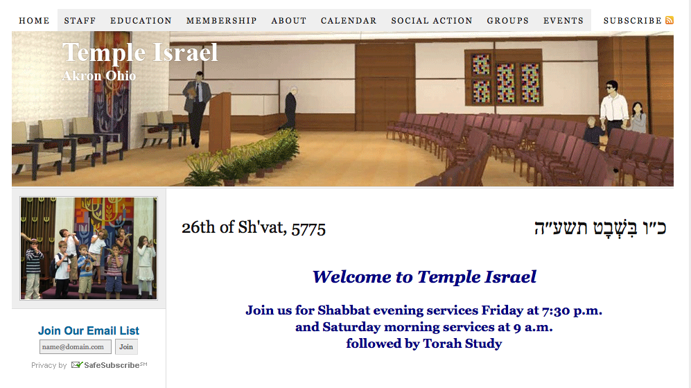
This is the introduction page to my dad's synagogue, Temple Israel in Akron. The featured image is one of the remodeled synagogue from one year ago. The one to the left of the children blowing the shofar (ram's horm) for Rosh Hashannah (the Jewish new year), flashes on the site and does not link to anything. I was involved in a focus group for the usability of this website, and it is very hard to navigate. Many photos on the site don't take people to where they want to go. The majority of the site's text is aligned to the center, which is not a natural movement for an English-speakers eyes who are accustomed to reading left to right. The Eyetrack study suggests type be aligned to the left because that is where people naturally begin reading headlines, blurbs and articles.
The last aspect of web design I want to review from the Eyetrack study is how to get readers past the first page of a site's homepage. When I say first page, I mean the initial opening of a page. The screenshots I have used in previous posts are first page shots—what the reader or visitor sees when they first open a certain site.
According to the study, a shocking or surprising image or trendy headline should appear at the bottom of the first screen for visitors to read on to content further down the page.
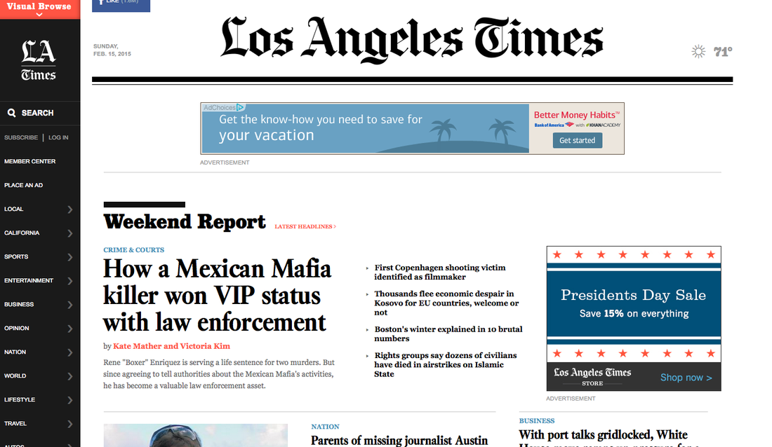
The LA Times uses a different layout on its homepage than most news sites. However, the bottom of its first page of its homepage works. Before scrolling down further, readers get a peek of the headlines "Parents of missing journalist Austin" and "With port talks gridlocked, White...." The second headline readers can expect has something to do with the White House. Readers who are politically passionate or keep tabs on U.S. government happenings will be drawn in by the verb "gridlocked." Anyone with a soul will be drawn into the headline "Parents of missing journalist" because it is a heart-grabbing perspective of the danger for journalists in the Middle East.
The LA Times site also uses a left side navigation bar, which I have called content bar in my previous posts. As a journalist, the layout of the LA Times website is interesting navigation-wise. The newspaper is owned by Gannet publishing company, which has a different approach to providing for its digital readers. Read my next post where I will explore Gannet's news websites and design elements as well as explore their reasoning for designing their sites the way they do.
The LA Times site also uses a left side navigation bar, which I have called content bar in my previous posts. As a journalist, the layout of the LA Times website is interesting navigation-wise. The newspaper is owned by Gannet publishing company, which has a different approach to providing for its digital readers. Read my next post where I will explore Gannet's news websites and design elements as well as explore their reasoning for designing their sites the way they do.
 RSS Feed
