Nav bars—the navigation bar or the menu toolbar at the top of many websites—is one of the more underappreciated aspects of web design by a site’s users.
More often than not, they get you to where you need to be (unless you’re clicking a link to something from social media). I would argue that they are the most important aspects of a website.
I found this rang true as I started to mess around with code on the website (my portfolio site) that I am working on for this class. Finding the correct nav bar can make the difference in someone spending two seconds on your site to someone spending a half hour on it.
So, in lieu of this sentiment and my newfound appreciation for nav bars, I give you a list of ones I like below.
Buzzfeed
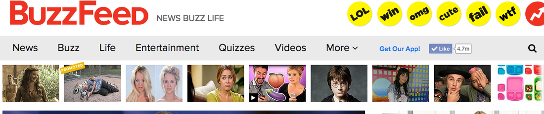
I know I’ve said it in previous posts, but I can’t say it enough: Buzzfeed’s website design is one of the most user-friendly out there. It’s nav bar offers categories where you can just click a category you’re looking for. The only dropdown menu is the link that says more, which is appropriate. One thing I don’t understand about Buzzfeed’s nav bar is why it doesn’t have social media icons plastered on it when every other part of the site does.
New York Times
New York Times

I like this nav bar for the same reasons I like Buzzfeed’s—it takes you to where you need to go. Looking at different nav bars, it seems to me that what news sites put on their homepage is dictated by the audience. It’s the stuff that the news organization knows their audience wants from analytics or the biggest news that day. The New York Times, like other outlets, uses its nav bar simply to direct people with one keyword, and that’s smart design.
Cosmopolitan
Cosmopolitan

This women’s magazine cuts to the chase with its nav bar. It has buzzwords (most likely the most popular categories) that people search for when they come to Cosmo’s site. I’ve noticed that more web-friendly and popular sites have this, and it’s a testament to how analytics is now how newsrooms operate—so much that it dictates the content in your nav bar. I also like that the nav bar seems to be suited for a mobile platform because it has the infamous menu sandwich I’ve spoken about in the top left in my previous posts.
Mashable
Mashable
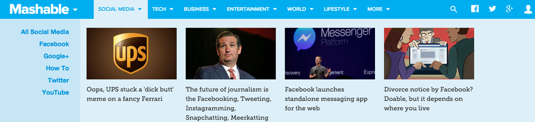
While I’m not a huge fan of detailed dropdown menus in nav bars, I think Mashable’s is designed well because its unintrusive into a visitor’s experience on its website. There’s nothing I hate more than trying to click on something and you have to scroll over five, mouse-sensitive pop-up links or icons. The nav bar’s dropdown menus are organized and uniform to where it doesn’t hurt someone’s eyes and is pleasurable to read.
Wired
Wired

Thank the Lord for techie sites! They seem to always have the best navigation because they know what its audience wants. I think Wired uses the same approach as Cosmo with its nav bar because it has displayed key words or subject areas that its readers click on the most. In a menu icon at the very top of the site is where visitors can access all sections of the site, but you have to click on it (an extra step for those who aren’t just the unique visitor).
I think it’s a smart thing for news organizations’ site analytics to dictate how their site is designed. It makes sense. The people are telling you what they read so why not make it easier for them to access it. Social media helps, but if someone likes an organization’s content, they’ll go to their site, and the nav bar must be ready.
I think it’s a smart thing for news organizations’ site analytics to dictate how their site is designed. It makes sense. The people are telling you what they read so why not make it easier for them to access it. Social media helps, but if someone likes an organization’s content, they’ll go to their site, and the nav bar must be ready.
 RSS Feed
