Why I think looks matter
On the web, looks matter.
The way a post looks or even a thumbnail image used to represent the post can grow or shrink your audience. The layout websites use can be a deterring or welcoming factor. If a page is cluttered and unorganized, chances are viewers won't spend much time on the site as a whole. If a page has absolutely no photos, the site's appeal wanes. This goes for all websites, especially those in charge of making news stories appealing.
Let's take screenshots of the home pages of three local newspaper's online affiliates: The Plain Dealer, Akron Beacon Journal and The Ravenna Record Courier.
1. Cleveland.com
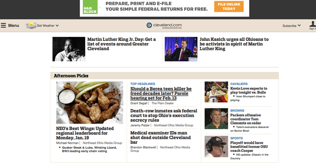
The viewer sees fives photos, minimal text and lots of white space when first stumbling onto this website. To me, it's not a bad layout. However, it doesn't have a strong hierarchy to distinguish which stories are featured. The picture of the chicken wings is only slightly bigger than the larger thumbnail images. However, I do like that they have relevant stories at the top with photos that people will recognize. I also know that white space is a good tool, but I think there is too much of it here. I would have maybe liked to see a Twitter feed or some type of social media link when seeing the homepage so that I know what type of following the site has
2. Ohio.com
2. Ohio.com
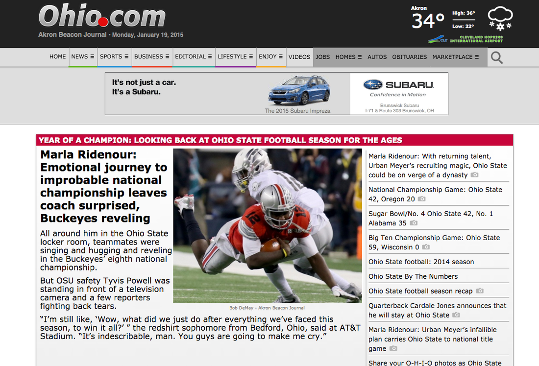
Holy text! The Akron Beacon Journal's site suffers from the opposite problems as The Plain Dealer's: text overload. When I approach a site, I do not want to read the whole story. I think the most effective layouts are image heavy with teaser text. That's literally all Buzzfeed is. From an editorial standpoint, I think the headline is way too long. I feel as though the home page is also for sneak peaks. This gives you the full story. Also, it is Martin Luther King, Jr. day, and no where does it mention that. I'm glad both the PD and Beacon change the layout of their sites daily because this wouldn't work for your daily news cycle.
3. Recordpub.com
3. Recordpub.com

This site is very advertisement heavy, which I don't like. It screams to me that they need all the ad money they can get to stay afloat. This might be the case, but why would they advertise that? Although the Record-Courier's site is mostly hyperlocal, I don't mind it. Where there aren't ads, there is a nice amount of white space. The feature image could be bigger, but at least these a sense of hierarchy. The small thumbnail images could also be bigger, but at least they are there. The editor's picks isn't too cluttered.
I know my critique may have been harsh on these sites, but it is only because I am used to coming to their individual story pages for information and usually the homepage of bigger, national news outlets when I want to get a feel for what's happening nationally and internationally. Are you the same way? Let me know. In the next post, I'll look at national news sites home pages and compare them to Northeast Ohio's online news sources.
I know my critique may have been harsh on these sites, but it is only because I am used to coming to their individual story pages for information and usually the homepage of bigger, national news outlets when I want to get a feel for what's happening nationally and internationally. Are you the same way? Let me know. In the next post, I'll look at national news sites home pages and compare them to Northeast Ohio's online news sources.
 RSS Feed
