
| 
| 
|
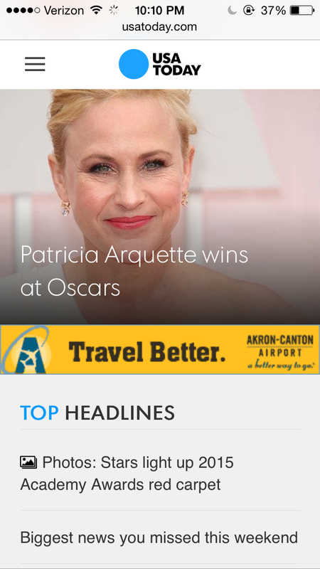
The answer to the above question is "I don't know." As said in my previous post, I outlined some of the aspects of good mobile design for news organizations, which included having the webpage be easily navigated by someone's thumb, having a short menu of options and connecting to social platforms and keeping the design of it simple. The above websites I have critiqued for their web design, which transfers to the mobile version. Notice, I am talking about apps. These screenshots are simply from going to these websites in my browser. Here's a few things I notice about this set in particular:
- Images: There is a large feature image with a headline that links to a story. Large feature images are also at the top of each story.
- Menu bar: A simple three horizontal lines is part of the mobile language that tells is there is more, that there is a menu of options.
- Multiple links: Not just one story fits in the 4x2 inch screen of your phone (Well, I have an iPhone 5. Some screens may be larger).
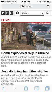
- Uncrowded simplicity: These sites in particular don't bog the reader down with information. I think in mobile design, they shouldn't people want quick news. They want to get idea of a story in 10 words or less. I think CNN does this well, especially with the breaking news bar they have for the Oscars. However, I like how the BBC has designed its mobile site better. It follows the "bite, snack, meal" method" Janice Redish suggests in her book "Letting Go of the Words." I can read a 25 word (more or less) description of the story, see the headline and maybe see a photo. Plus, I have easy access to the site's menu and homepage. What more could a mobile user want?
| 
| 
|
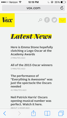
The image of the right is Vox media's site. Like I said, I like that the headlines give readers a good idea about what the story says, but this mobile layout is not visually appealing enough. It's plain and simple, which is good. However, I would like to see more of a visual element to accompany stories. I do like that they have Facebook and Twitter icons on the homepage, which shows that they are social media friendly. I also think the arrow next to the icons for its menu adds a unique stylistic element, which often lacks in mobile news design.
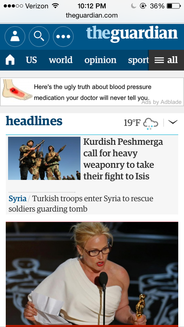
Next to BBC, The Guardian's design has to be my favorite. It has a clear menu option, and I like that it lists some of the content pages at the top. The most popular pages views don't have to scroll though the menu to find. I also like that the weather is visible and that the site successfully fits three stories onto its opening screen (one being a photo, which tells a story in itself).
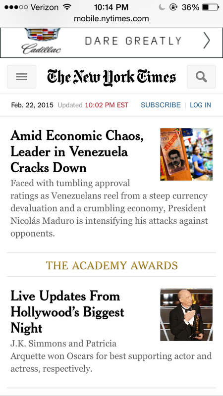
The New York Times uses the tiniest thumbnails known to mankind on its mobile site. I like the use of its links, especially with The Academy Awards, and that each story has a short description of what it is about. It's similar to BBC in its mobile features, but fits three stories into the front screen when you first open it. Unlike Vox, it doesn't shove 5 headlines—only headlines—in your face.
It's interesting to see how images, words and icons work together in mobile design with one goal to mean something to the reader. Next. I'm going to analyze what makes a good app, which ones I like and what draws people to apps instead of opening a website in their browser.
Next to BBC, The Guardian's design has to be my favorite. It has a clear menu option, and I like that it lists some of the content pages at the top. The most popular pages views don't have to scroll though the menu to find. I also like that the weather is visible and that the site successfully fits three stories onto its opening screen (one being a photo, which tells a story in itself).
The New York Times uses the tiniest thumbnails known to mankind on its mobile site. I like the use of its links, especially with The Academy Awards, and that each story has a short description of what it is about. It's similar to BBC in its mobile features, but fits three stories into the front screen when you first open it. Unlike Vox, it doesn't shove 5 headlines—only headlines—in your face.
It's interesting to see how images, words and icons work together in mobile design with one goal to mean something to the reader. Next. I'm going to analyze what makes a good app, which ones I like and what draws people to apps instead of opening a website in their browser.
 RSS Feed
