Still on the topic of homepage design, I would like to share some examples of pages of local news sites that I think have a great homepage design. Local news sites in bigger cities tend to have the money to support better web designs and a better CMS because they reach a larger population, and therefore, probably get more money because they have more sources of ad revenue and more subscribers.
First, let's start in Ohio. I know before I said most of the local sites aren't sexy, but I think the Columbus Dispatch, the daily newspaper of Ohio's capital does it right.
1. Dispatch.com
First, let's start in Ohio. I know before I said most of the local sites aren't sexy, but I think the Columbus Dispatch, the daily newspaper of Ohio's capital does it right.
1. Dispatch.com
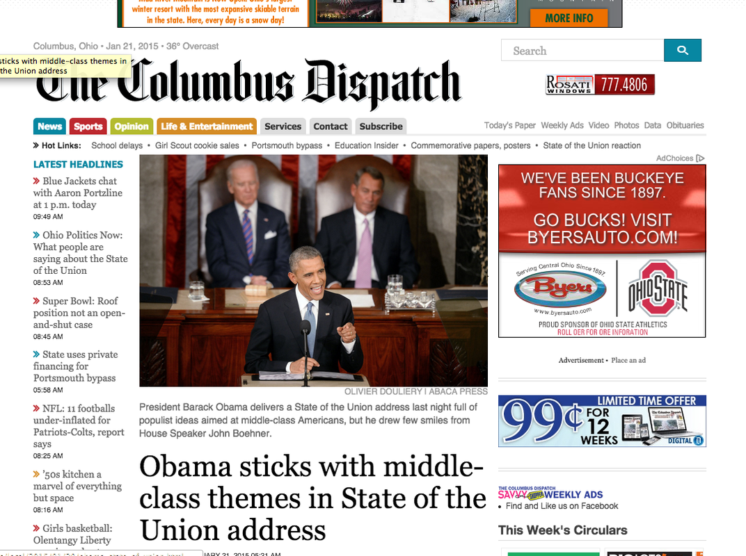
The Dispatch, where I worked as an intern over the summer, has a very clean layout. It has lots of white space and there's plenty of information "above the fold" for visitors to scan. Interestingly enough, the Dispatch's "latest headlines" bar is on the left side instead of on the right how most newspapers do it. Their content is relevant with a story about the State of the Union as the featured story. One aspect that I find visually pleasing on the site is that it's not afraid to use color. I like the colorful tabs at the top as well as the colorful carrots to indicate difference stories in the latest updates tab. I also like that the "hot links" are at the top to give the visitor more of a chance to visit different pages on the site.
2. NYTimes.com
2. NYTimes.com
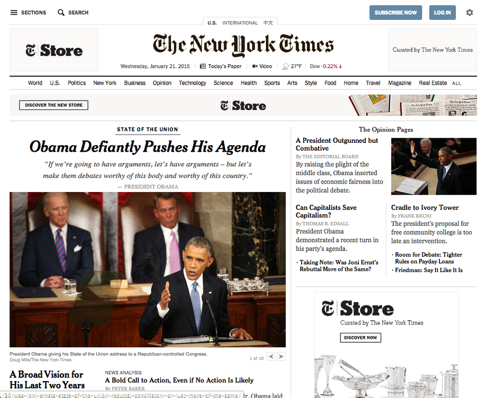
The New York Times is known for its texty pages, but I believe its home page is anything but that. I swear every website I looked at to wrote this post had the same picture of Obama. Again, the white space on this site is nice. I can easily navigate it. I especially like the NYT's content bar at the top of the page. It's easy to read for a paper its size and includes many quick options for the reader to click on and scan over easily.
3. Washingtonpost.com
3. Washingtonpost.com
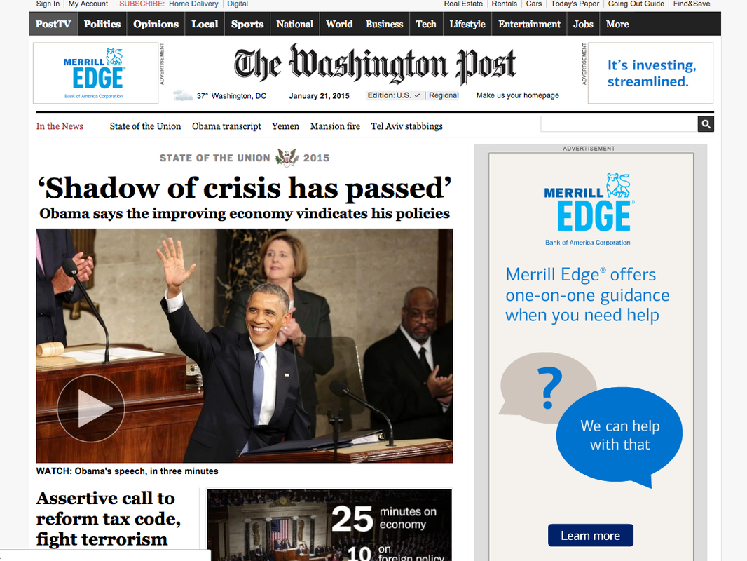
The Washington Post used a different way to report on the State of the Union address by putting a video on its homepage, which I like. I also like that the "In the News" bar is prominent and includes phrases of no more than three words. However, I do not like the content bar at the way top of the page. I feel like it gets lost. If I want to go to the Entertainment section, I would have to think about where to go for it instead of see and it automatically quickly click on it. I believe in this case, the Post owned their cover story since they are the principle voice in news in Washington D.C.
 RSS Feed
