Are national news sites the peak of design in web news design? Not quite.
Although national news sites have more money and can therefore afford a better CMS and better layout software, the designs of their home pages aren't the best. However, they have more aspects that I like, which i will review.
1. CNN.com
1. CNN.com
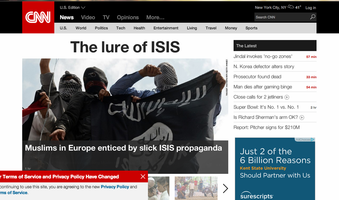
I started with the one I like the best. CNN usually has great photos to back up its (mostly) solid reporting, which makes the site even more reader friendly. I like the size of the feature story and that the viewer can change what the feature story is by sliding though the thumbnails below the feature image. I like that stories are simply labeled and that despite lots of information being on the homepage, there is still white space and a simplicity to it. I also like the "Latest" sidebar next to the feature image. The headlines are short and to the point, and there is enough stories showing to digest their headlines all at once and decide which ones you, as the reader, want to click on. I hate when so many story headlines show up in a news sites' latest updates bar on its home page because usually the headlines are too long and there are too many. I also like that at the top, there are many options to leave the homepage and take you to a specific area of the site. Most news sites have pages that are clearly marked with these types of headings.
2. USAToday.com
2. USAToday.com
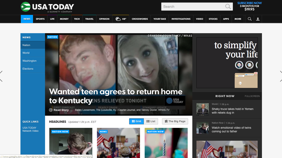
With USAToday.com, I again like the large feature story. I also like that visitors can use the arrows on the sites of the site to scroll to different pages. The visuals, again, are what sells this site. I like that USA Today also has the blue sidebar on the left with quick links to take visitors to certain parts of the site that are popular. I think it's smart that they have a what's trending, called"Right Now," sidebar on the right that gives readers a sense of what people are talking about. I don't like the site's color scheme. I knew USA today is known for its logo that reflects it's color scheme, but black and blue remind me of a bruise.
3. NBCNews. com
3. NBCNews. com
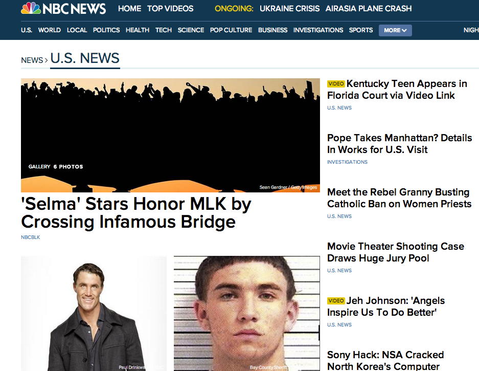
This is quite aesthetically pleasing. There are three feature images and and six large headline that balance out the page. There is white space as well. I think one thing I specifically like about NBC News' site is that they have an "ONGOING" bar in with the site's name is to show that the site is still following trending stories. I also like that stories with videos have a certain flag next to the headline and that each story is categorized in an organizational fashion.
I've noticed that national news sites tend to use more photos, have stronger and catchier headlines or story teases, have image heavy feature stories and a have pages that are easy to navigate to get to specific parts of the site. While the local examples I looked at in my previous post had social media buttons on the top of the site, national sites did not, which seemed peculiar to me. Each national news site had a section for videos, which helps support the claim that visuals sell news websites (just like print!).
Another thing I did notice was that broadcast news sites like CNN and NBC had more pleasing layouts than print news sites. Do web designers for a print publication need to be more broadcast centered? Do they need to look to broadcast news sites to design a site that readers will want to search though. I don't believe that is the case, as some further examples I have in mind will show.
 RSS Feed
