I remember from my design class I took last year at KSU that my teacher said Swiss design was the pinnacle of design. It's simple, easy to use and functional. She specifically used the phrase, "form follows function," to describe it. Many times, Americans discount ideas, including designs, from foreign countries because they present a different way of thinking apart from the American mindset of how we usually think about design. Looking outside of one's country for design ideas can yield a great reward for those looking to think outside the box.
1. El País
1. El País
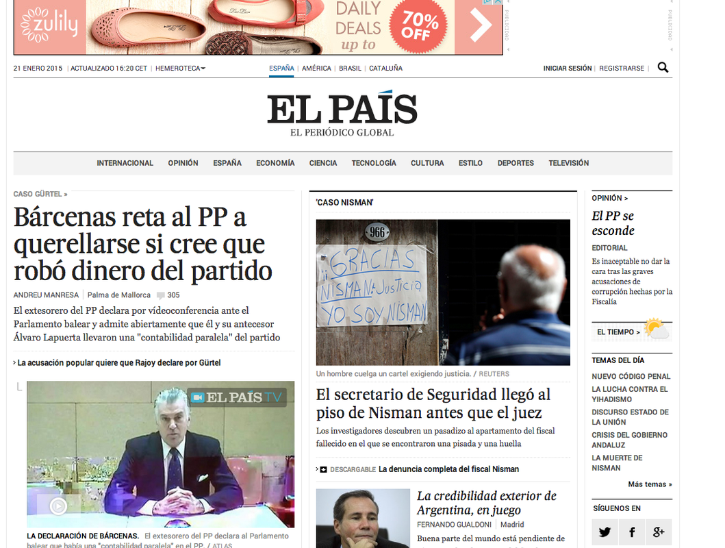
El País is a Spanish global newspaper as you can see with the different options at the top for news in Spain, America, Brazil and Catalonia. When I studied abroad in Spain, El País was my go to news source. However, I had to be careful with how to take its reporting because it is known as the liberal newspaper in Spain. The design of the site is visually pleasing. There are two feature stories, one of them being a video. The text is easy to read and the contents bar isn't overcrowded. I do not like the ad at the top of the page, but I guess it's inevitable because that's what pays for the site. I also like how they integrated the thin panel at the right and fit three things in it—an opinion piece, the weather and "temas del día" or subjects of the day, that each have a place there. It also has a nice logo that transfers, like most sites, from page to page.
2. BBC.com
2. BBC.com
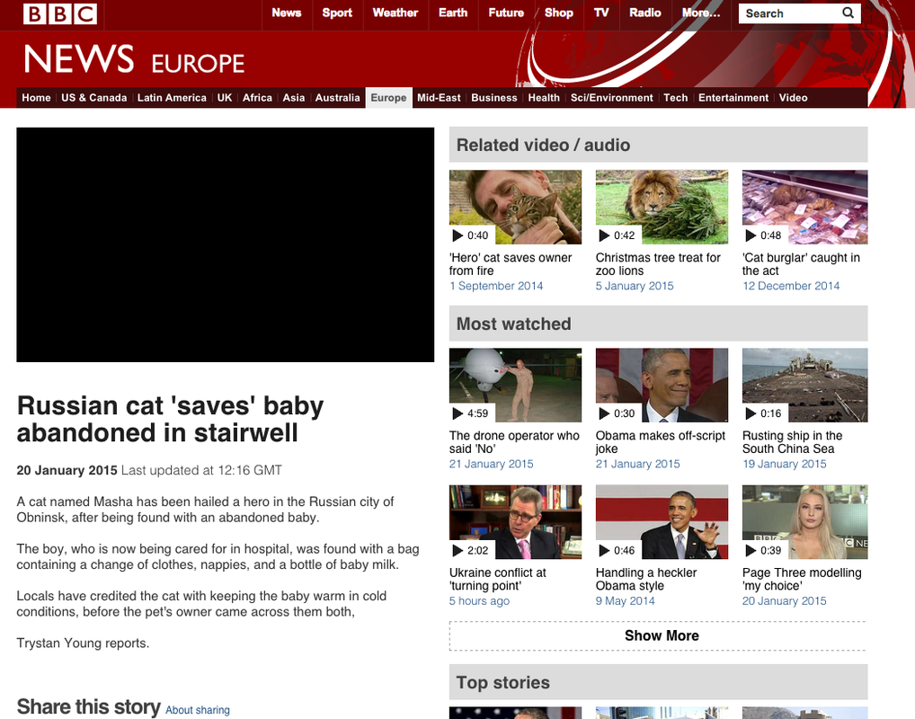
For international news, I also like to go to the British Broadcasting Company. Their layout usually consists of thumbnail videos and when clicked, a linked article appears. The layout of this BBC page I believe isn't all that appealing because a few paragraphs of the story appear on the home page. I can scan through it easily, but I'm not a big fan. I do like the two content bars at the top because they break up all the content the BBC offers. It has a recognizable logo and the homepage has many options for access to different articles or pathway pages.
3. Al-Jazeera.net
3. Al-Jazeera.net
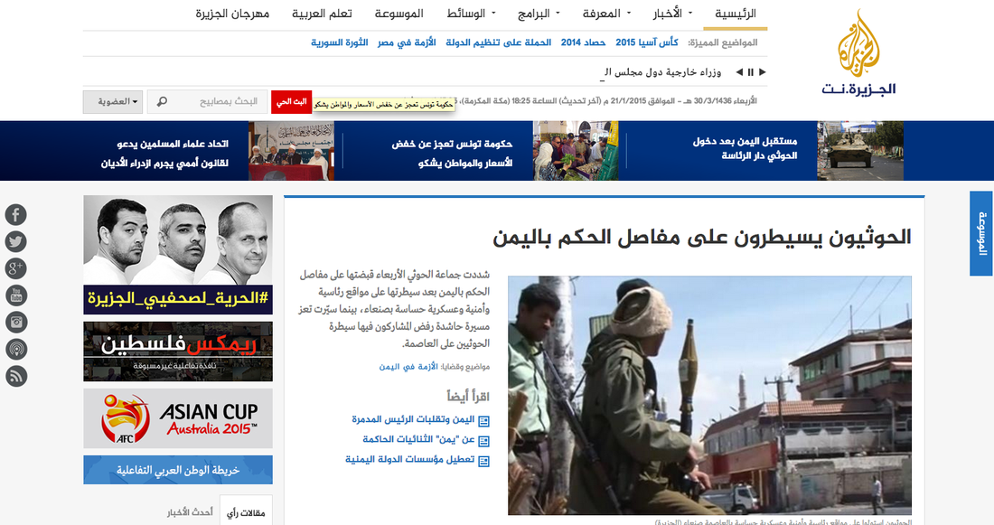
Al Jazeera.net is one of the newspaper's popular in the Arab world with a very successful English affiliate. Most of the site is rag-right because you read arabic right to left. Overall, I feel this site looks a bit unprofessional for a major news site; however, it is not in my language so I do have some bias when critiquing it. I like that blue headline bar across the page with the photos because it stands out. I also like the social media icons on the right because it shows all the places online Al-Jazeera can be accessed; however, I do think they could be integrated into the site better. I don't like the advertisements on the right, but American sites had them on the left, so reading the site this way could be normal for an Arabic-speaking audience.
 RSS Feed
