As a Spanish translation minor, I’ve visited many bilingual sites and cited them as sources in various projects.
Through this, I’ve developed a love-hate relationship with them. Yes, I love that they are bilingual or even multilingual, but sometimes, the way they are designed just doesn’t make sense.
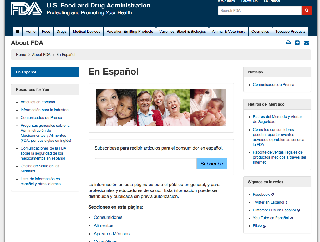
For example, I hate when the layout of a site is different when you switch languages. The U.S. Food and Drug Administration's website is a good example. I also hate when the site is only partially translated or keeps some links in English. That is not helping the LEP (limited English proficiency) population that the organization wants to help.
Through this, I’ve developed a love-hate relationship with them. Yes, I love that they are bilingual or even multilingual, but sometimes, the way they are designed just doesn’t make sense.
For example, I hate when the layout of a site is different when you switch languages. The U.S. Food and Drug Administration's website is a good example. I also hate when the site is only partially translated or keeps some links in English. That is not helping the LEP (limited English proficiency) population that the organization wants to help.
 |  |
I also don’t like when the site transfers to another language but doesn’t transfer cultural language. For example, if the site uses a photo or color that doesn’t mean the same thing to their target population they are not transferring meaning culturally.
Most global corporations and government sites recognize this. However, there are some—like Ohio.gov—that aren’t translated. Only the Ohio government’s ancillary sites are translated, for example, like benefits.ohio.com.
Most global corporations and government sites recognize this. However, there are some—like Ohio.gov—that aren’t translated. Only the Ohio government’s ancillary sites are translated, for example, like benefits.ohio.com.
 |  |
I do like how you can transfer between language with a click of a language button on this site, but I don’t like how some of the page is not translated and that the site didn’t change the image when going from English to Spanish to Somali.
According to WebResourcesDepot.com and Omniglot.com, below are important aspects to look for in a bilingual website.
Flexibility in design
According to a story on Omniglot.com, bilingual and multilingual sites should be designed so each page is flexible to fit the text of the target site. For example, a nav bar could change from English to Spanish because some of the links in it are too long or short for the design to look complete. Some languages don’t have spaces between letters or read from right to left (like Arabic). The design of a site needs to be flexible in order to it to make sense when translated into another language.
Linking between languages
As I said before, I prefer seeing language icons at the top of a page, clicking on a language and having the site give me the page’s equivalent in another language. When I’m doing a translation, it helps to see how the two are different. However, site navigation and the thought process behind it may not be the same for one culture or people who speak a certain.
I also find it interesting how websites indicate they are bilingual or multilingual. Let’s use the Spanish language as an example. Some say “En Español” at the top of a page, which is effective. However, when I see the “Spanish” link at a top of a page, I think this doesn’t help LEP patients on the off chance they may not know what their language translates to in another language. An effective way to communicate a language change is to use flags. For example, a Spanish equivalent of a site usually has the flag of Spain. However, this is also tricky as not all Spanish-speaking countries speak the same type of Spanish as Spaniards do.
Colors and images
Colors mean different things in different cultures. For example, the color purple in Western cultures often symbolizes royalty or wealth while it symbolizes sorrow in Eastern cultures and countries like India. In terms of design, Western cultures prefer more minimalistic design while Eastern cultures gravitate toward loud, colorful designs.
Localizing
Websites should reflect the needs of the target population, and localizing a site is one way to do so. If there is certain information that is specific to a country, websites should have it updates. In terms of design, if a company knows that in a certain region, an image or idea is taboo, they should not use it across all of their sites even if it conveys the message they want in every other country.
 RSS Feed
