As I browsed through the 2014 Webby Award winners, I knew there were more sites I needed to talk about and analyze. The web design was just to good to not show my readers more! Since this blog is about news design, I'm going to highlight mainly how news organizations have displayed effective designs online, but I do encourage everyone to check out the winners for themselves.
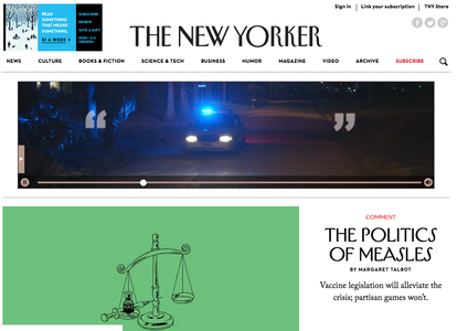
First, let's examine the Best Web Writing category. The New Yorker, known for its text heavy print pages, is one of the winners. Ironically, the site's homepage utilizes white space for its sleek, simple and beautiful design. The stories are written in the same long format, which means that the site is reader specific. It attracts people who want to read commentary, narratives and investigative pieces. After clicking on stories, however, I realized that despite the story length, the crisp design helps readers get through the blocks of text. The New Yorker has thought about what its web readers are willing to read, and I think the serif text spaced out effectively and in blocks that don't take up the entire length of the screen are effective. The white space around it helps readers clear their mind and focus on the story that they came to the site to read.
First, let's examine the Best Web Writing category. The New Yorker, known for its text heavy print pages, is one of the winners. Ironically, the site's homepage utilizes white space for its sleek, simple and beautiful design. The stories are written in the same long format, which means that the site is reader specific. It attracts people who want to read commentary, narratives and investigative pieces. After clicking on stories, however, I realized that despite the story length, the crisp design helps readers get through the blocks of text. The New Yorker has thought about what its web readers are willing to read, and I think the serif text spaced out effectively and in blocks that don't take up the entire length of the screen are effective. The white space around it helps readers clear their mind and focus on the story that they came to the site to read.
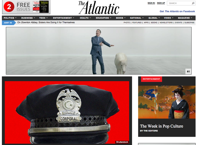
Another great example I wanted to highlight is The Atlantic magazine. The front page, like The New Yorker's site, doesn't try too hard. It simply lays the information out in a thoughtful, approachable way. The featured image when a user first visits the site is of a scrolling story gallery with photos and text. It gets four stories across to the reader simply through a headline, deck (small description of the story below the headline) and an image. The stories underneath it are designed in blocks and follow the "bite, snack, meal" method Janice Redish suggests. in her book, "Letting Go of the Words."
In contrast with the New Yorker, The Atlantic's story pages are significantly shorter. They reflect that the magazine has adapted its content for web, adding a related video section to the piece. What I liked about The Atlantic is that many of their headlines are conversational. They ask questions like "Why Don't Kids Walk to School Anymore?" and "What's in Those Haribo Gummy Bears?" Like The New Yorker, the site uses a serif font in the text of its stories.
In contrast with the New Yorker, The Atlantic's story pages are significantly shorter. They reflect that the magazine has adapted its content for web, adding a related video section to the piece. What I liked about The Atlantic is that many of their headlines are conversational. They ask questions like "Why Don't Kids Walk to School Anymore?" and "What's in Those Haribo Gummy Bears?" Like The New Yorker, the site uses a serif font in the text of its stories.
 RSS Feed
